Problem
Community organization sites often serve many audiences at once, which can make navigation feel broad and unclear. Users may arrive needing support, wanting to donate, or looking for resources, but those paths can compete.
Design Sprint · UX Research · UI Design
A design sprint and prototype for a community organization, focused on improving resource discovery, donation pathways, and support navigation.
Overview
Stonewall Columbus was approached as a design sprint: understand how different audiences move through community content, then prototype a clearer path to resources, support, and donation actions.
The work balanced brand expression with usability. The goal was not just to make the interface more visual, but to help people quickly understand where they are and what action to take next.
Community organization sites often serve many audiences at once, which can make navigation feel broad and unclear. Users may arrive needing support, wanting to donate, or looking for resources, but those paths can compete.
I contributed to the design sprint, information architecture, interface direction, and prototype decisions. I helped translate broad community needs into clearer navigation groups and more direct support pathways.
Methodology
Identified key user groups and the different reasons they might visit the site.
Looked for places where resources, support, donation, and learning paths overlapped.
Created a clearer navigation model with stronger hierarchy and visible action areas.
Used a softer, expressive visual system while keeping the page easy to scan.
Process Artifact
The sprint deck established the project context, team, and design direction before moving into prototype decisions. It helped keep the work grounded in shared goals and a focused timeline.
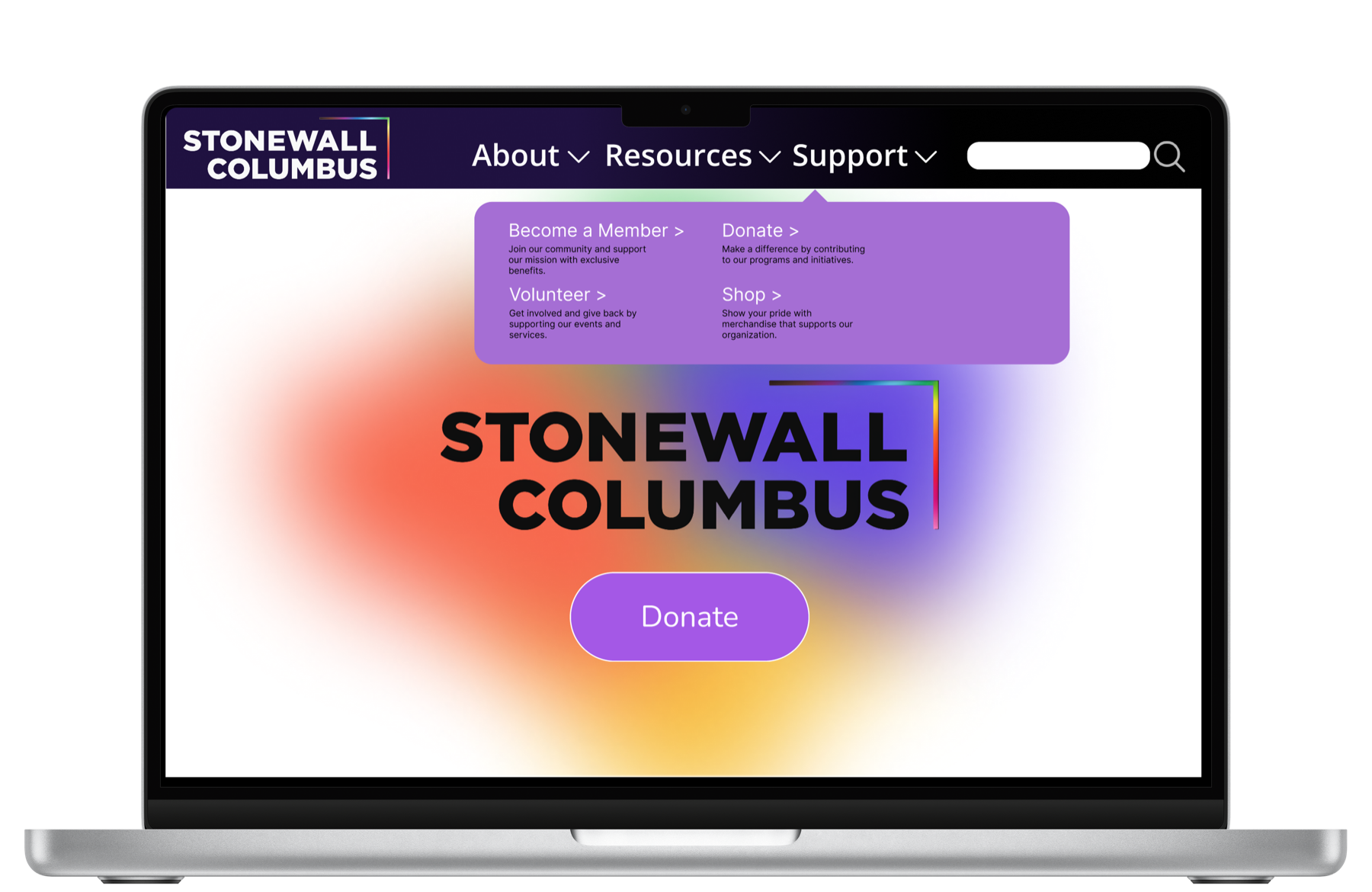
I grouped the experience around clearer top-level choices: About, Resources, Support, and Donate. The prototype uses bold hierarchy, visible search, and stronger calls to action so users can move through the site with less uncertainty.
This project sharpened how I think about community UX. A strong interface has to welcome people emotionally while still giving them practical, accessible paths to support and information.
Primary navigation areas clarified for different visitor needs.
Interactive Figma prototype created to communicate the redesign direction.
Design sprint completed with a collaborative project team.