Problem
Conservation experiences can become information-heavy, making it hard for users to understand where to begin. The challenge was to clarify the path from learning about the mission to choosing a concrete support action.
UX/UI Design · React · Accessibility
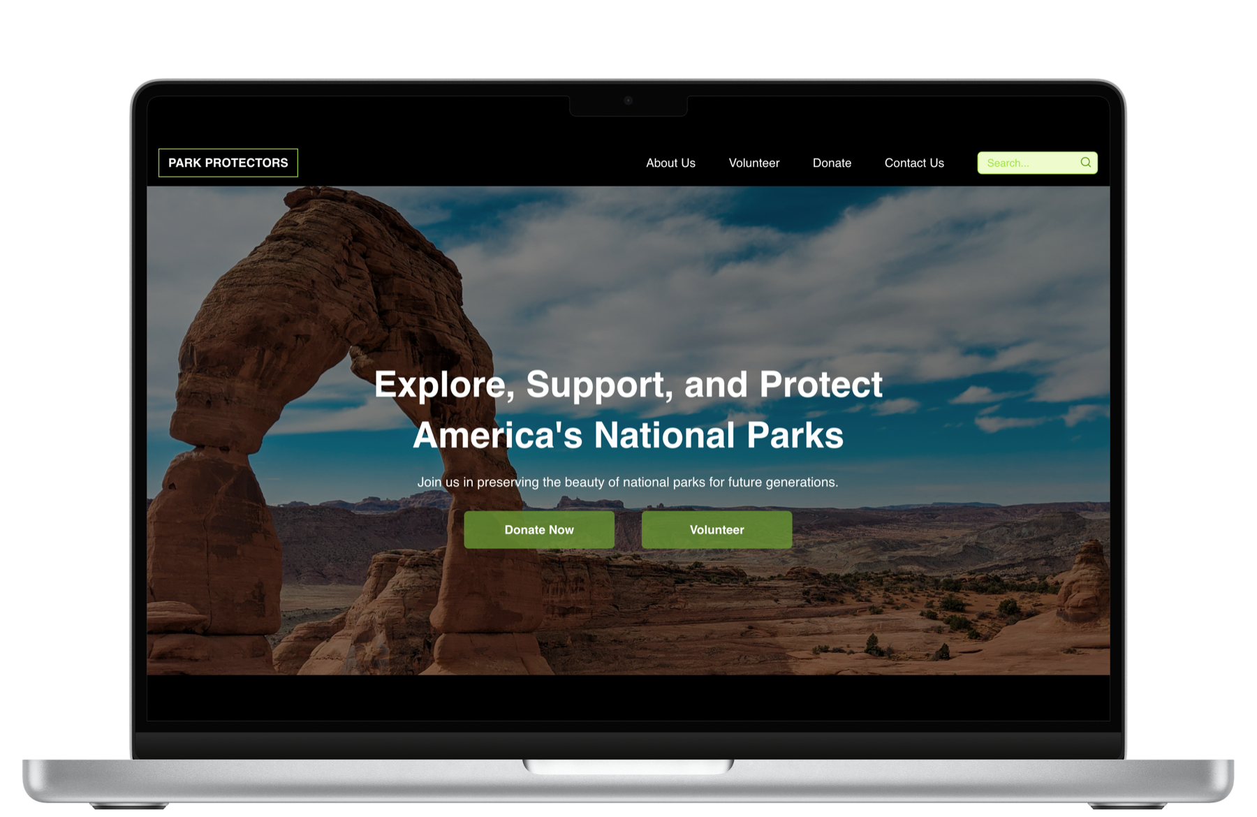
A responsive advocacy and donation experience that helps people discover national park conservation efforts, understand how to help, and take action with less friction.
Overview
Park Protectors began as a conservation-focused product concept for people who care about national parks but need clearer ways to get involved. The site brings together education, volunteer stories, donation entry points, and park information in one cohesive experience.
The project gave me room to connect product thinking with front-end execution: organize the user journey, prototype the interface, and build a working responsive site.
Conservation experiences can become information-heavy, making it hard for users to understand where to begin. The challenge was to clarify the path from learning about the mission to choosing a concrete support action.
I shaped the information architecture, created wireframes and high-fidelity UI direction, then translated the experience into a React site with responsive layouts and clearer calls to action.
Methodology
Defined key user needs around park discovery, conservation education, volunteering, and donating.
Mapped landing, donation, and confirmation flows before refining the visual system.
Built a warmer conservation brand system with clear hierarchy, accessible contrast, and direct CTAs.
Translated the design into a responsive front-end experience and published the working site.
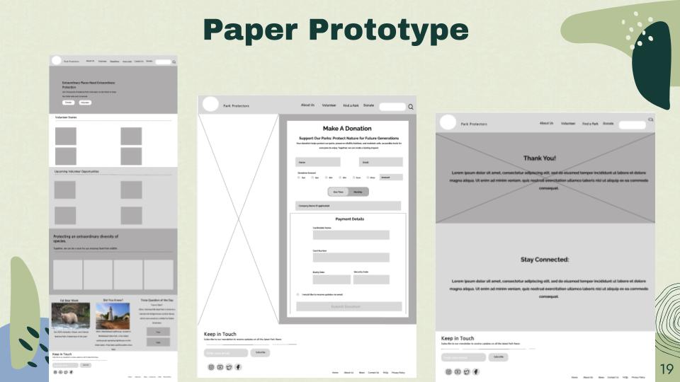
Process Artifact
The early prototype focused on the core user path: landing page, donation flow, confirmation, and follow-up. This helped keep the build grounded in user action instead of decoration.
I used a strong hero image to create immediate context, then organized the page around volunteer stories, park opportunities, and donation actions. The visual language uses earthy greens and warm accents to support the conservation theme.
This project reinforced how important it is to connect UI polish with a clear task model. A beautiful page only works when users understand what to do next and why it matters.
Core screens planned across landing, donation, and confirmation flows.
Primary user actions clarified: explore, volunteer, donate.
Responsive React site built and published for review.