Independent redesign concept
Residential remodeling · Website redesign
MIK Homes
Website Redesign
Creating a more refined, photo-forward digital experience for a Columbus remodeling company.
- Role
- UX/UI Designer + Front-End Developer
- Scope
- UX Audit, Information Architecture, Wireframing, Visual Design, Prototyping, Front-End Implementation
- Tools
- Figma + front-end development
- Timeline
- August–September 2026
01
Overview / Challenge
Presenting strong craftsmanship with the same level of refinement.
MIK Homes already had strong craftsmanship and project photography, but the website experience did not present that work with the same level of refinement.
The existing MIK Homes website successfully showcased the company’s craftsmanship and remodeling expertise, but inconsistent visual hierarchy, dense content, and competing navigation elements made the experience feel less refined than the work it represented.
02
Existing Experience / UX Audit
Focusing the audit on the moments that created the most friction.
A heuristic review identified six recurring issues. Two representative screens are shown here rather than presenting every audit artifact.
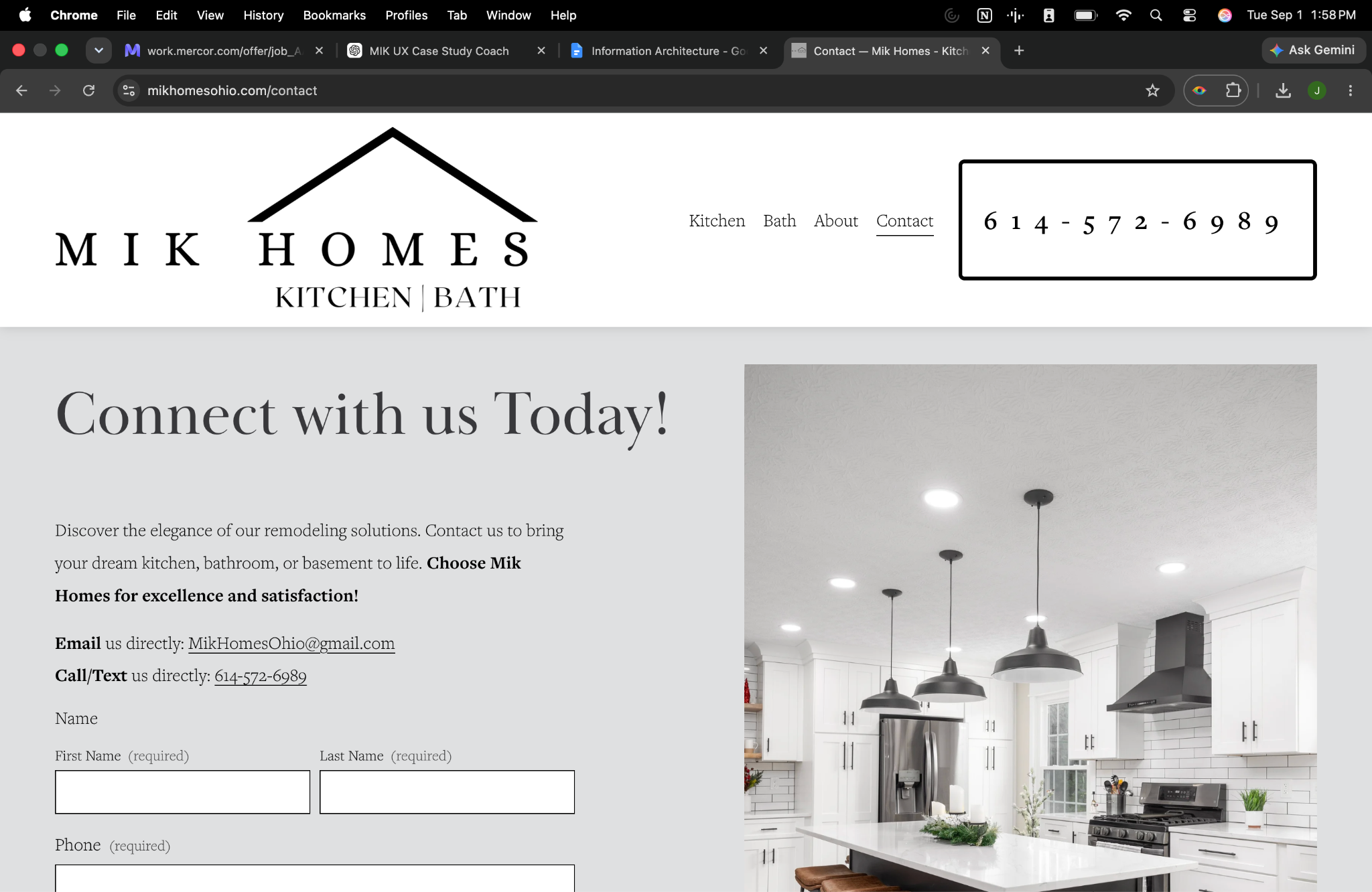
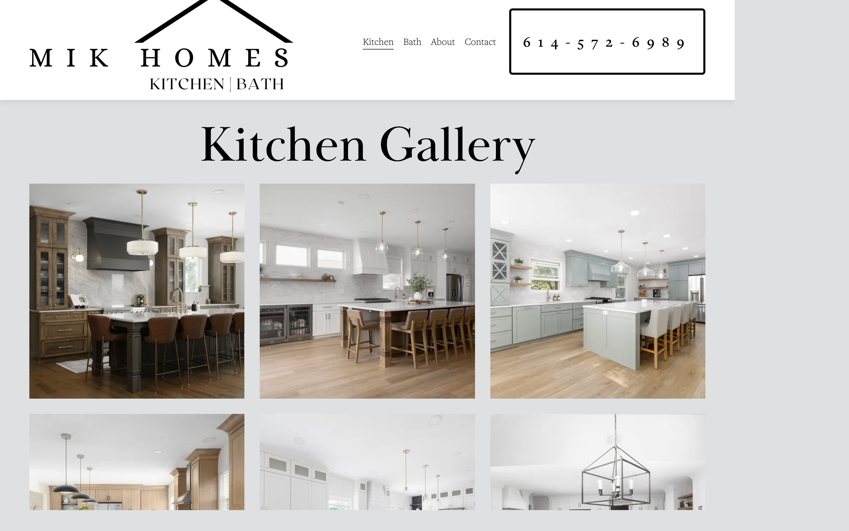
- Inconsistent visual hierarchy
- Content difficult to scan
- Repetitive navigation and content architecture
- Strong photography not fully leveraged
- Repeated reviews and calls to action
- Too much process information presented at once
Competitive Review
Looking at how remodeling companies build trust online.
I reviewed remodeling competitors to understand how similar businesses presented craftsmanship, built trust, explained their process, and guided homeowners toward consultation. The strongest experiences consistently prioritized project photography, simplified the remodeling journey, and kept navigation focused on homeowner intent.
HOME Craft
Nicholson Builders
- Photography builds confidence
- The remodeling process should feel approachable
- Navigation should reflect homeowner intent
03
Simplifying the Information Architecture
A smaller navigation with a more intentional homeowner journey.
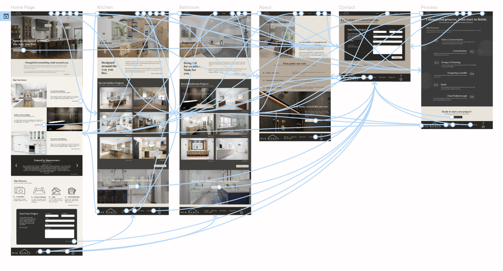
The primary navigation was simplified to Kitchens, Bathrooms, About, Our Process, and Contact / Start a Project. Home remains available through the logo rather than taking up navigation space.
KitchensBathroomsAboutOur ProcessContact / Start a Project
Hero↓Who is MIK?↓What can they do for me?↓Can I trust them?↓Show me the work↓How does working with them work?↓I’m interested — let’s talk.
04
Design Direction
Letting the craftsmanship shape the visual system.
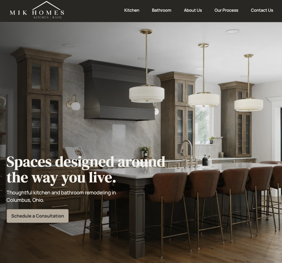
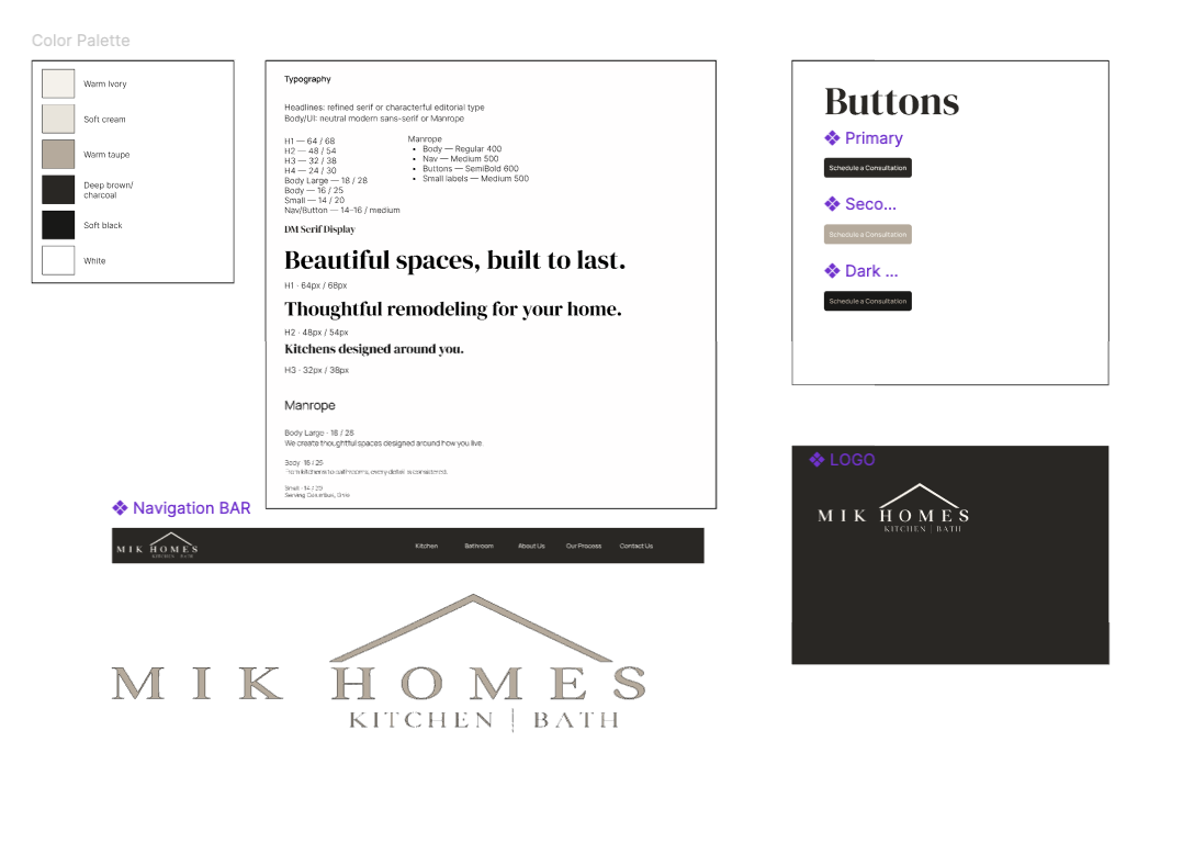
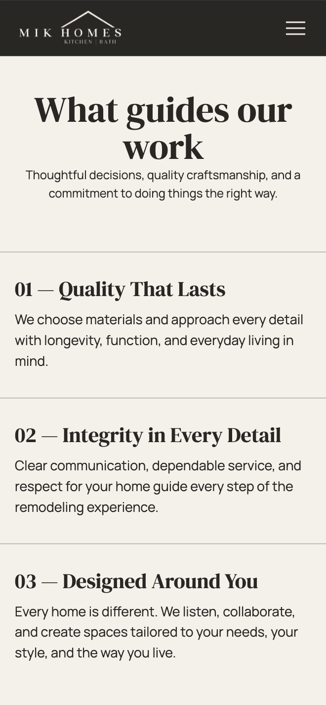
The visual direction was intentionally restrained so MIK Homes' project photography could carry the experience. A warm neutral palette, editorial typography, generous spacing, and consistent interaction patterns created a more refined presentation without competing with the work.
Photo-forwardRefinedApproachableClearTrustworthyFocused
05
From Wireframes to High Fidelity
Building the experience from structure to interface.
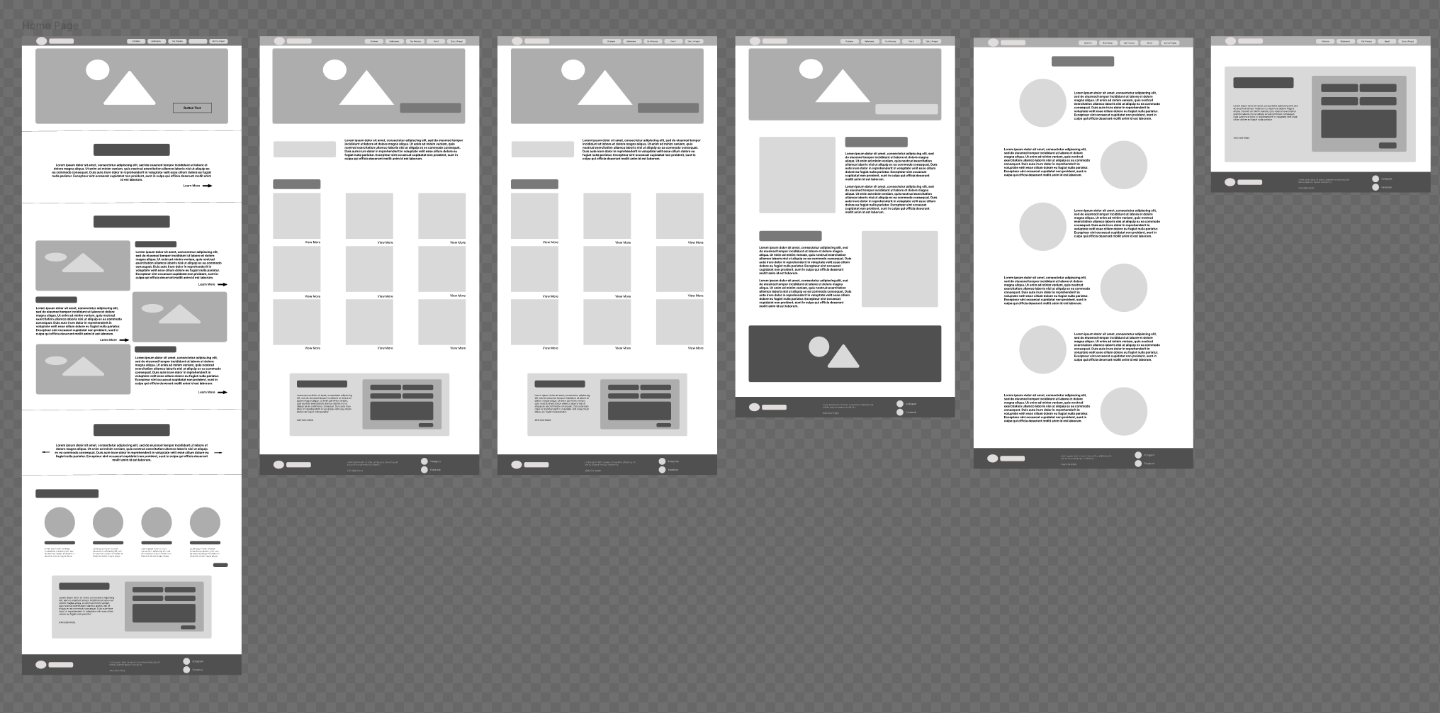
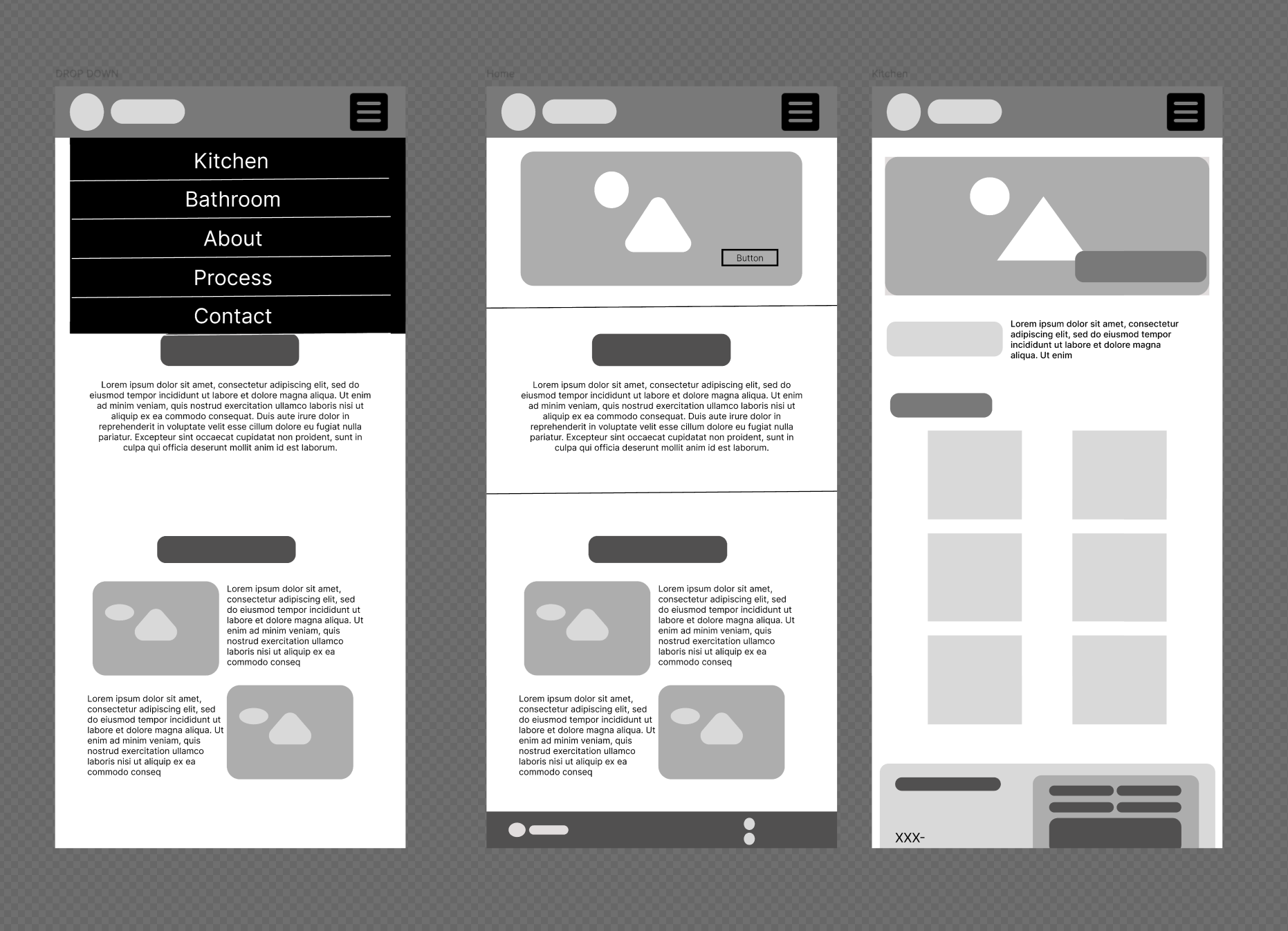
Low-fidelity wireframes established content hierarchy, page patterns, and responsive behavior before the visual language was applied across the experience.
Desktop low-fidelity
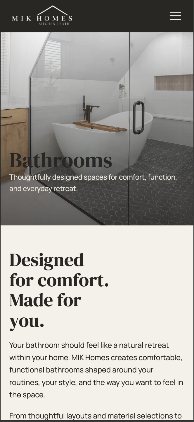
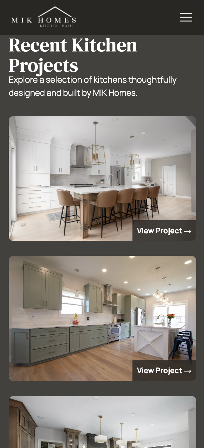
Desktop high-fidelity
06
The Final Experience
A more cohesive path from first impression to consultation.
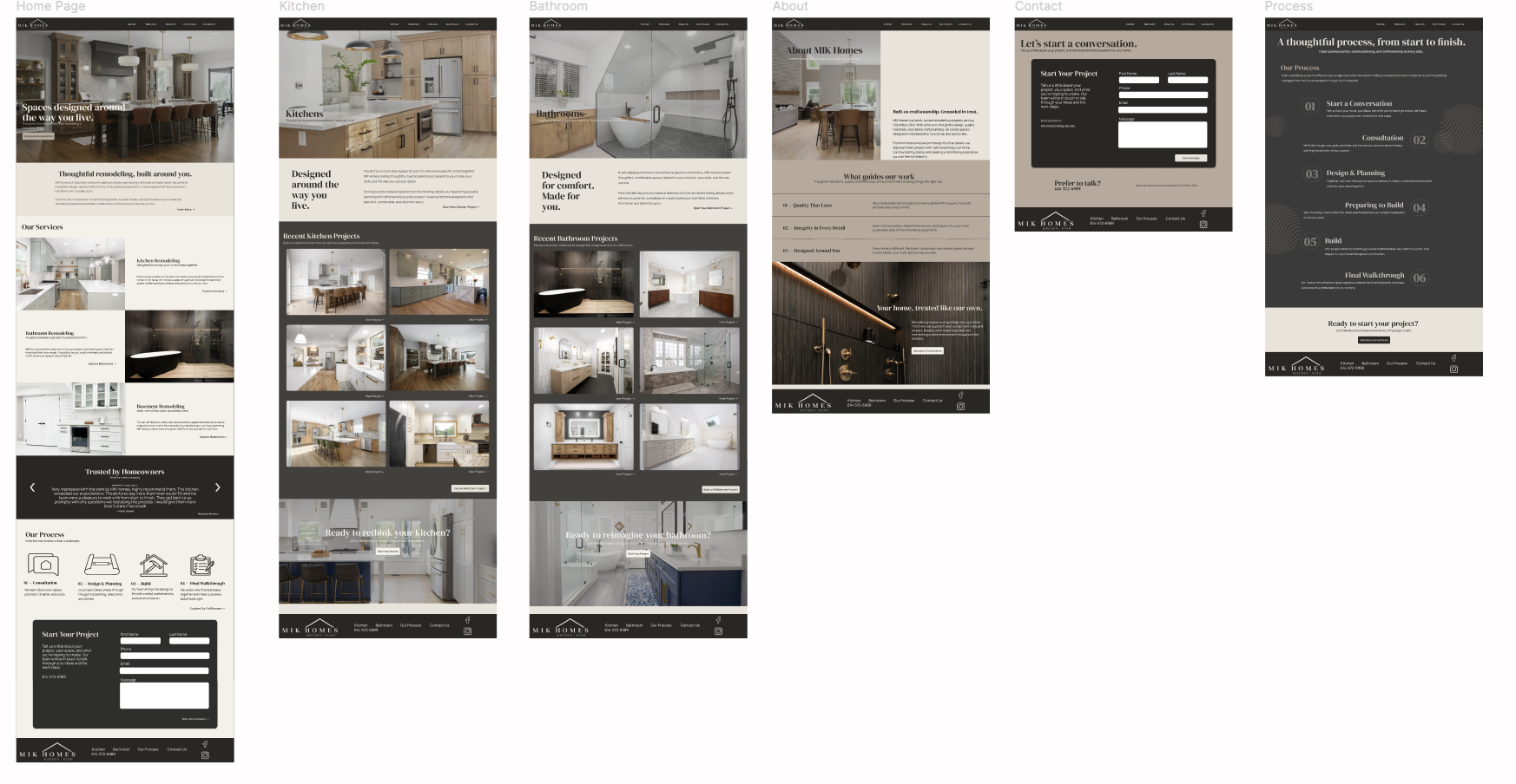
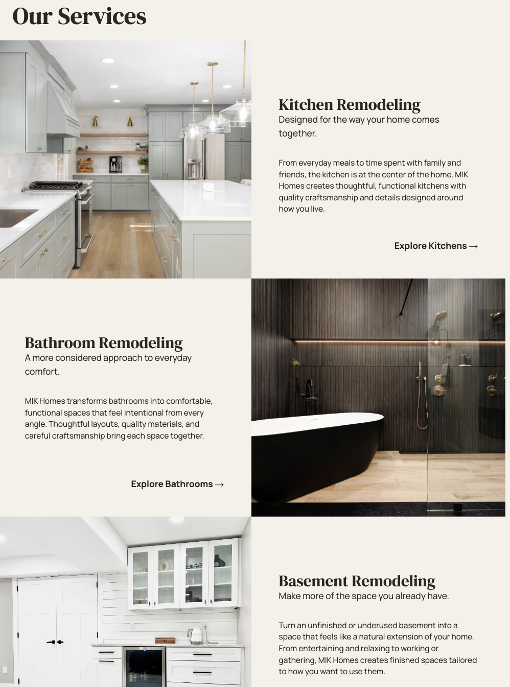
The final direction gives photography more priority, simplifies navigation, shortens content, improves project browsing, and introduces the remodeling process progressively.
Homepage
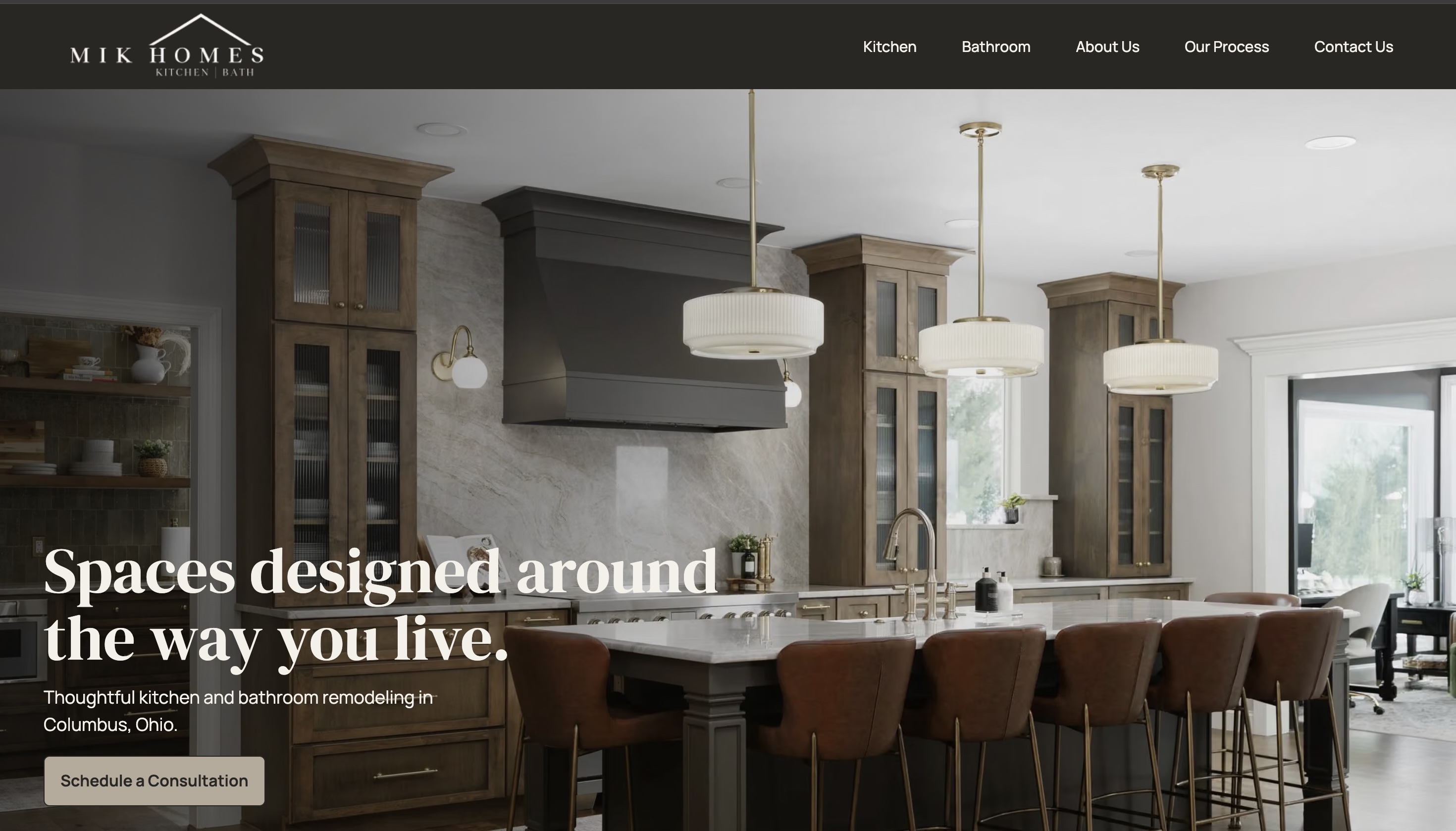
Craftsmanship leads the story.
Large project imagery establishes quality immediately. Services, trust, process, and consultation then follow in a deliberate sequence.
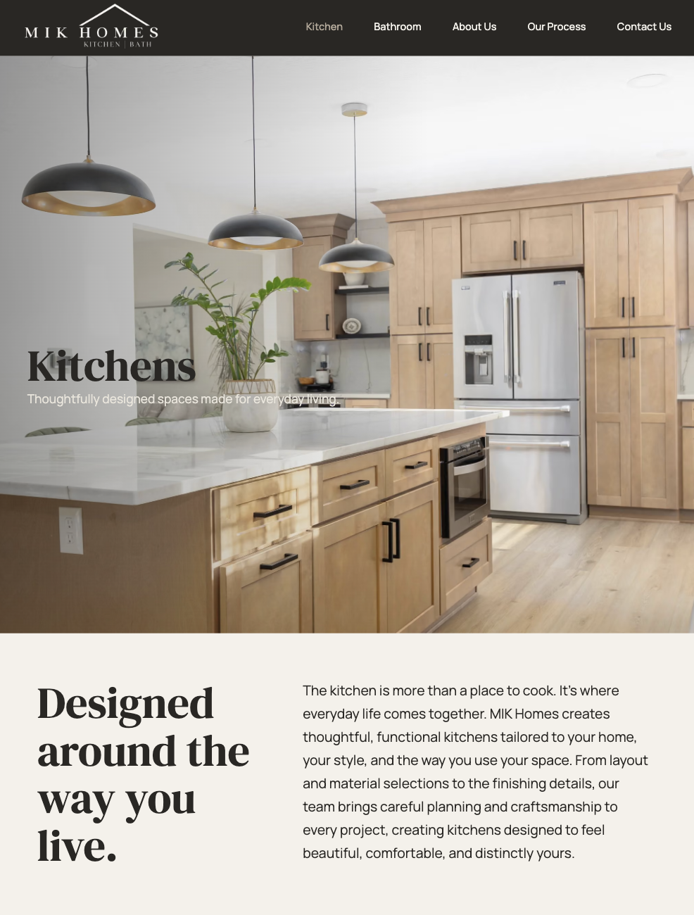
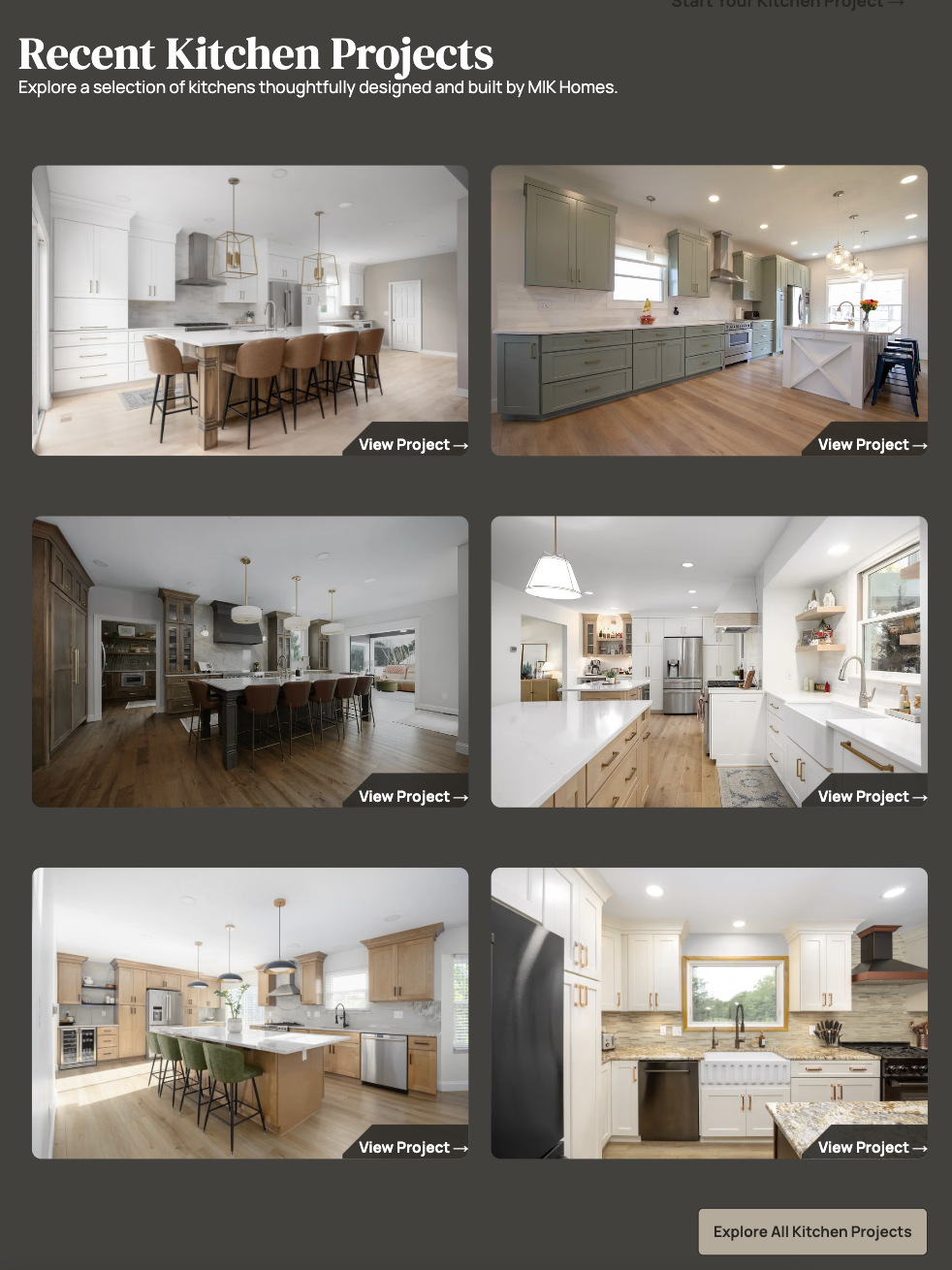
Kitchen
Project browsing becomes direct and visual.
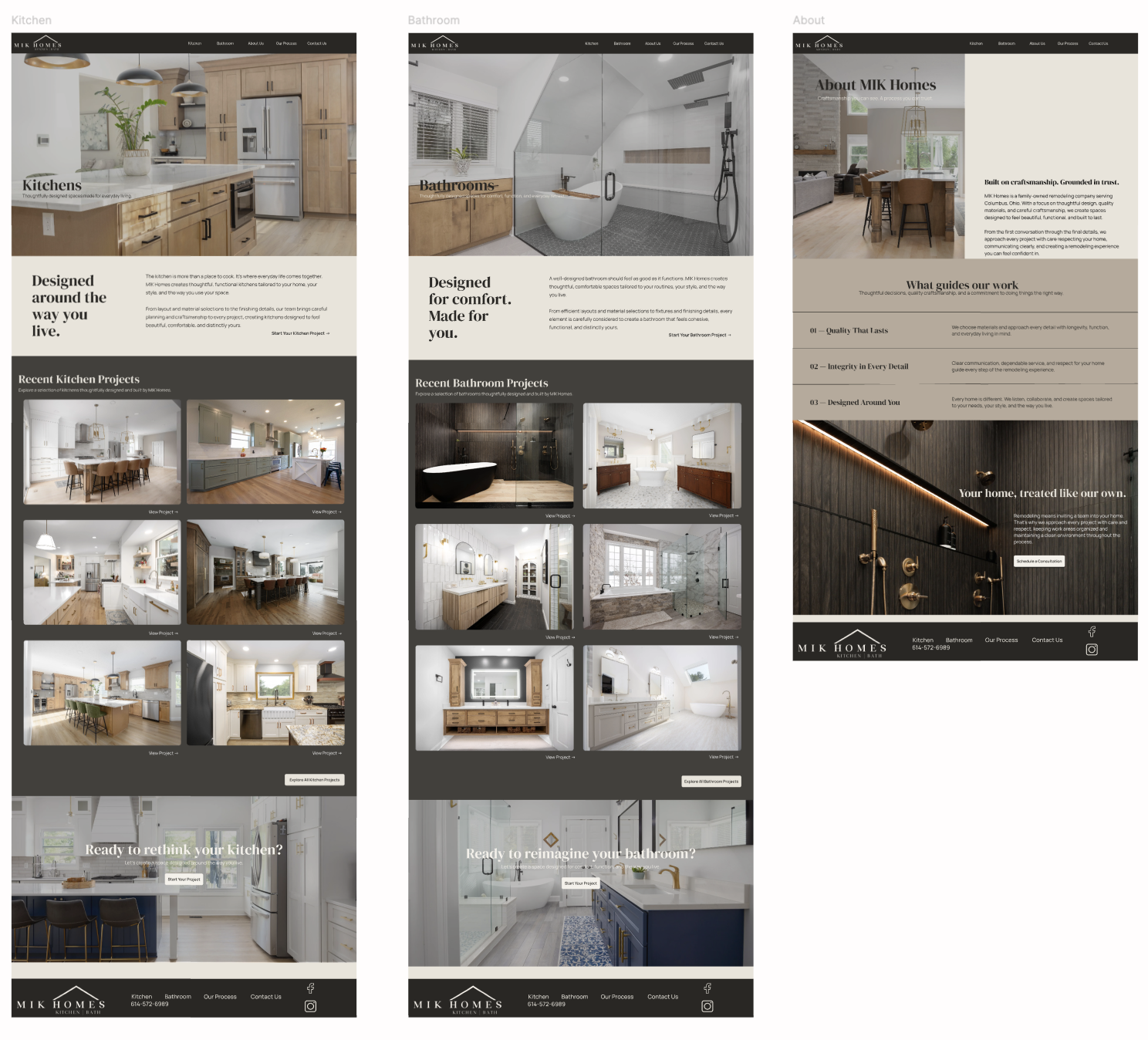
A concise service introduction leads into a large, scannable project gallery with clear project-level actions.
Bathroom · About
Each page keeps one clear purpose.
The Bathroom page mirrors the project-led service pattern, while About organizes the company story around craftsmanship, trust, and guiding principles.
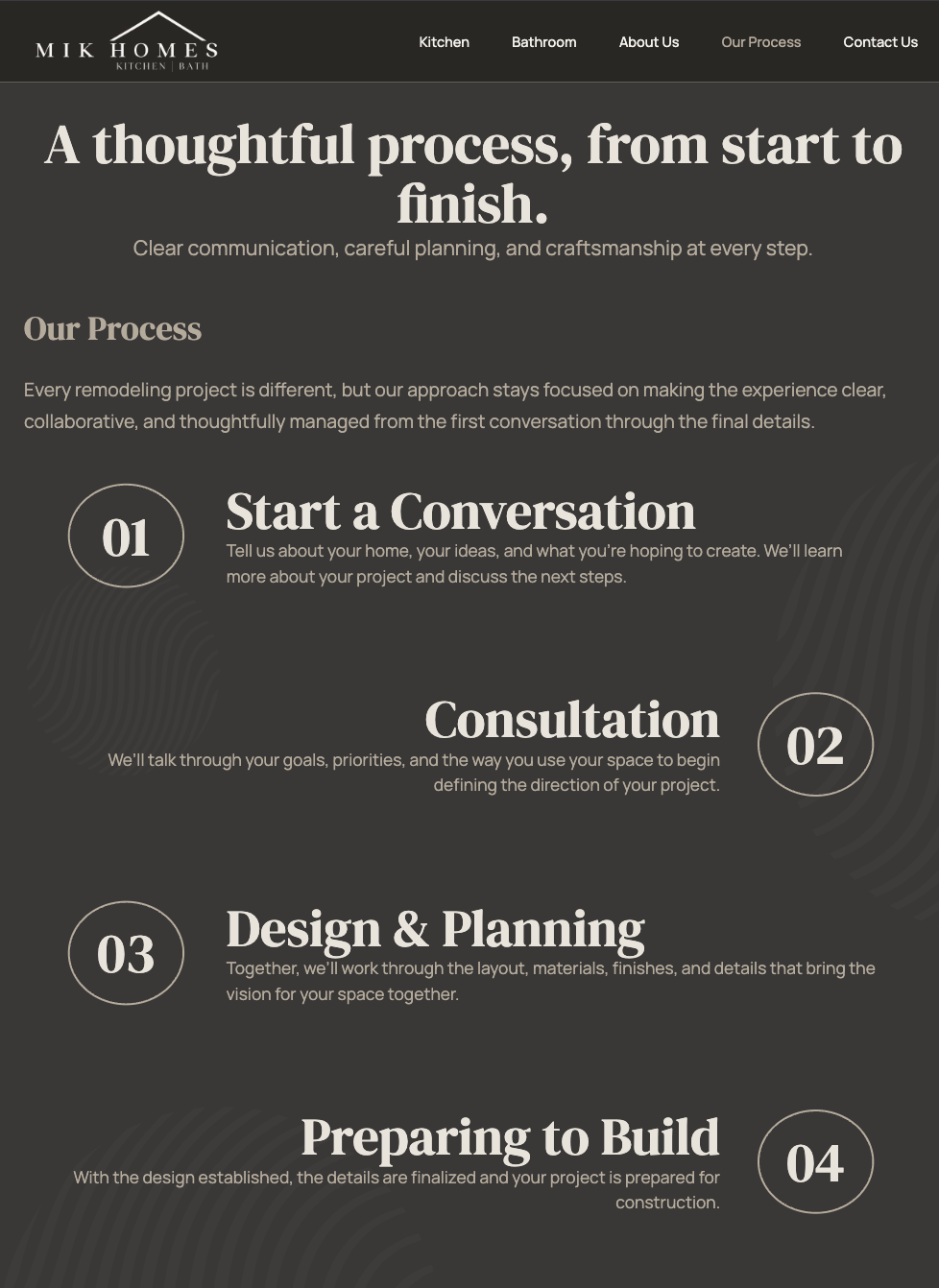
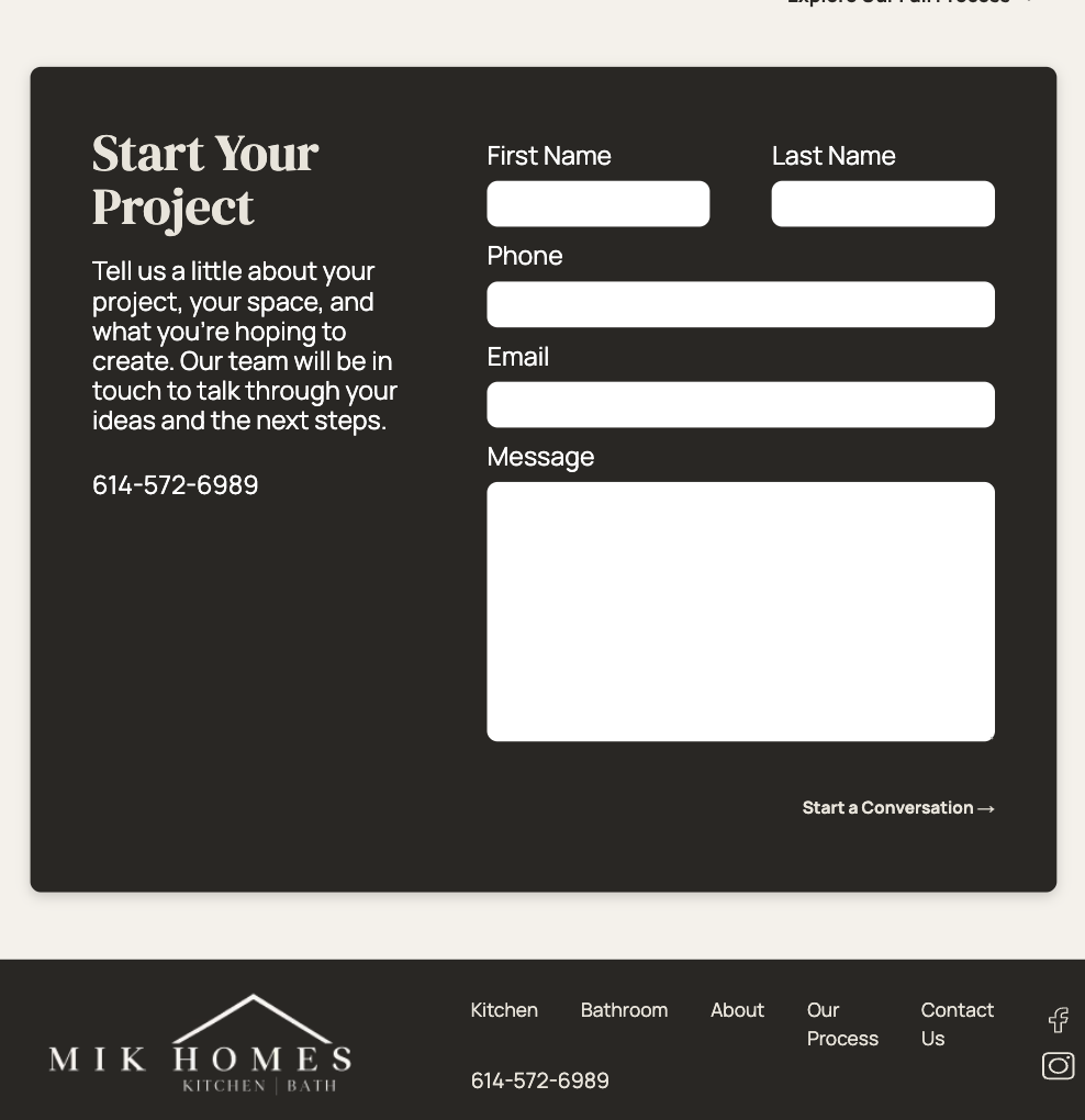
Process · Contact
Complexity is revealed progressively.
The homepage introduces four high-level steps; the dedicated process page explains six. Contact provides one focused route toward consultation.
07
Building the Experience
Taking the redesign beyond Figma.
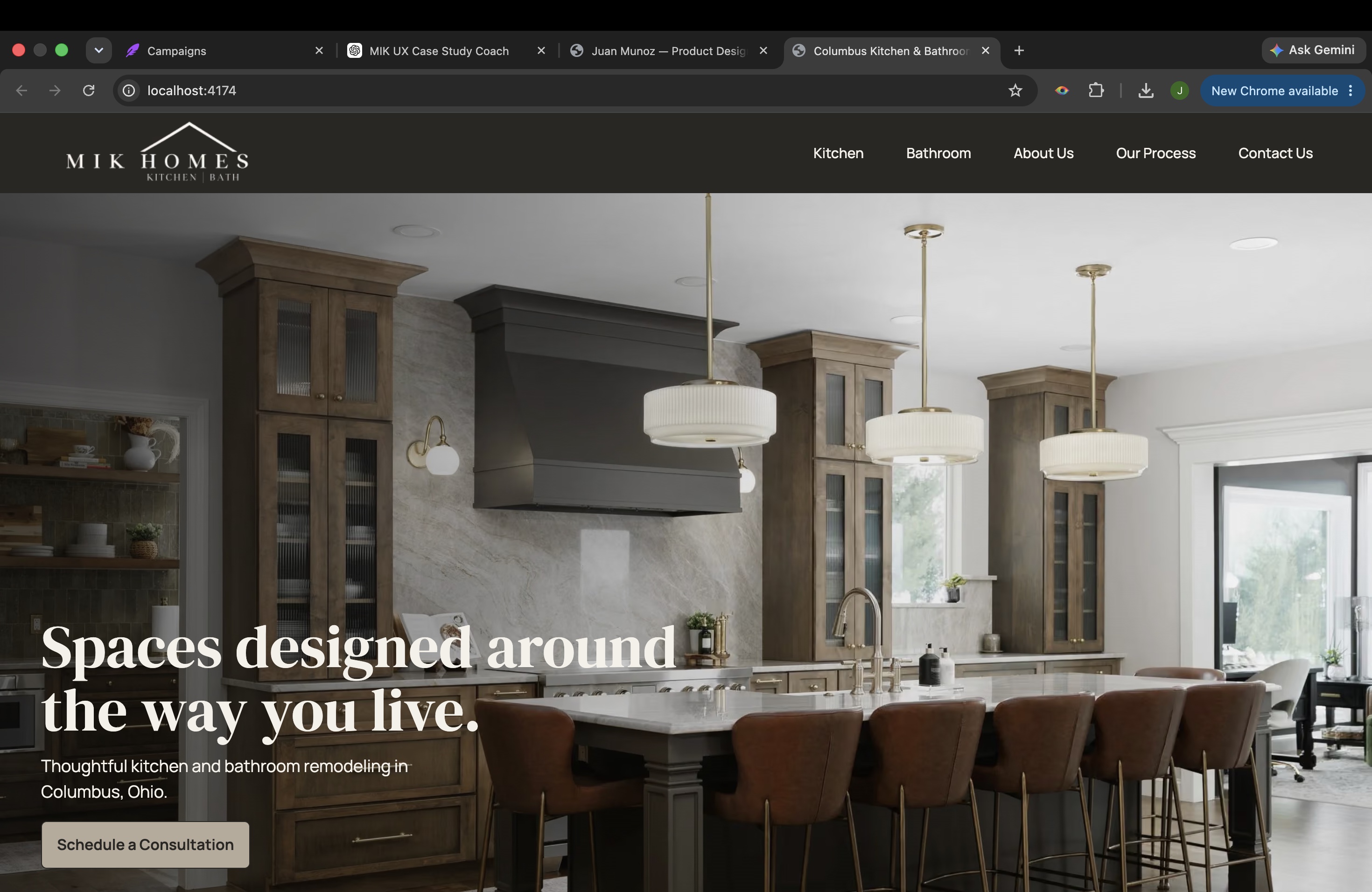
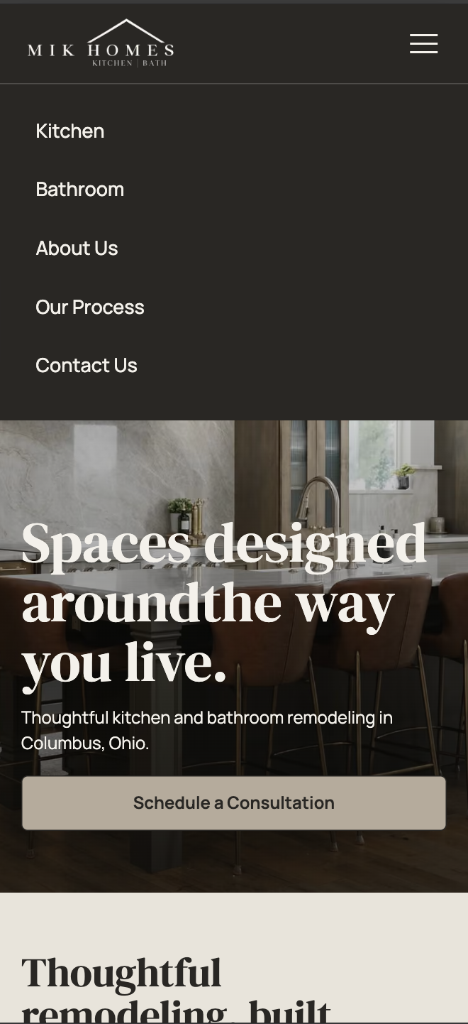
The concept was implemented as a responsive front-end experience and reviewed across desktop and mobile layouts.
This work is presented as an independent redesign concept, not as MIK Homes’ current production website.
08
Reflection / Outcome
Balancing strong visual design with usability and business goals.
The redesigned concept simplifies the navigation structure, gives project photography more visual priority, presents the remodeling journey progressively, and provides clearer paths toward consultation. Together, those decisions create a more cohesive digital representation of MIK Homes’ craftsmanship.
This project reinforced that visual refinement is most effective when it grows from clear structure. Balancing photography, concise content, trust, and responsive behavior helped me design an experience that feels expressive without asking homeowners to work harder to understand it.